2. Building And Selling Digital Products
The Futur

The Futur is a company that aims to help you build a business and make money from it.
That is roughly the idea that I have got from it.
It has:
- 31k email signups
- 32k backlinks
- about 28k monthly visitors
- welknown Chris Do as the founder. "Chris
Do is an Emmy award-winning designer, director, CEO and Chief
Strategist of Blind and the founder of The Futur—an online education
platform with the mission of teaching 1 billion people how to make a
living doing what they love"
- It is a very artsy website, with graphical flourishes, very clean and very bold lettering upon strong colours
There seems to be a lot going for The Futur
Can The Future increase revenue?
It seems like this is said on repeat, but. We are not saying the site
is bad or good, what we are trying to say is: if we checked it out,
would we sign up, would we buy stuff from the site?
Would we?
I don't know.
In some ways yes and other ways no.
That is what the website does to me. I am just unsure of what it is trying to be and it is trying to do a lot of things that it makes it very confusing on what to go for first.
- There seems to be different levels within the website.
Accelerator
and Pro. I can only find these 2 but not the brand lab. [Update]. I
found it. Its on the first page under a small link called "maturity
phase". This is stated: "Welcome to Brand Lab: A mastermind built
for left-brained entrepreneurs, authors, thought-leaders, consultants,
coaches, and media mavericks. You’ve mastered the art of business and
are ready to master the business of art. We can help." Unsure what that actually means and would some business, who are successful, care?
- Whats the difference? I don't know until I found the Pro Group there is a Q&A; section which states:
- Accelerator is designed for creative service providers who are either just starting, or struggling your business off the ground, with the ultimate goal of reaching $100K in yearly revenue.
- Pro is designed for creative service providers, coaches, and consultants looking to scale with a combination of coaching and community.
- Brand Lab is for business owners who have reached the $1MIL mark in their business and want high-touch, weekly group coaching with Chris Do in a group with elite entrepreneurs.
- Then we have products and courses which are designed to be for the graphical community, personal improvement and business. There is an odd product in there: How to land the dream job. But the website is all about getting your business up and running and making it profitable? But when you read more, it it about getting jobs that students from high end art schools would get.
So I am starting to get that the website is geared towards more artistic businesses- like graphical design? But their mission suggests all business.
Which one do I go for first?
It
is still a question that I do not know and the website doesn't really
answer it. If it does, you have to really find those answers.
- There is so much space that when I think I have finished it keeps on going. Space and artistic image is cool but it might not be one that converts into paying people? Check out the screen grab from the Pro area link. This is just the top sixth of the page, when you go down there is more text. It is big words and text. Its just a lot.

- Chris Do. The main positive and negative of The Futur is the creator. Chris is being promoted throughout the website which is cool, but it also gives you the idea that The Futur is Chris and no-one else. Is he going to be too busy for me? But then within the mission statement I find that there is a Pro-Group- expert advisors. Do I see them instead of Chris? Some of the testimonials suggest that Chris does give advice. The experts can be found on the Pro-Group page. But when you look for Experts it goes to these 4 (one chopped off on the side)- you drag the mouse across. You can't click on them. So why are they experts? What have they done?

- Email countdown/ count up. The email numbers is a cool idea but it suggests that it is the amount of people that have signed up not necessarily the amount of people that you have helped: as your Mission states: "Teach one billion people how to make a living, doing what they love (without losing their soul)".
- Testimonials. The testimonials are OK. If a few. Should there be more media about them like in a video? Also, would case studies be more helpful? You do have testimonials sprinkled through the various packages so thats cool. But again, they, the words and pictures are all separated by a lot of space which then makes you possibly subconsciously "forget" what you just saw
- Colour. The packages are so black and white, which artistically is cool, but to grab you feels dull and not exciting. But then when you get to the end, of most pages, you jump to store items. So first we have big gaps between points:

Text, a Q&A; then the sign up button, then this:

So people can click away to courses that are cheaper (in the long run) and bypass your sales page.
- Newsletter. There is a sign up box. Now I dont normally show the newsletter box but check that picture out:

It was tucked into the bottom corner, out of sight. Would have been better on the first page, as a pop up, as something that you can see plainly? It looks great. Like tons of bonuses just for joining...for free. So you click on the button and at the end of the sign up form there is this, in plain sight, not hidden:

Now there was no place to put credit card details, but that paragraph is a slight red flag right? Might not be intentional, but it just makes you wonder.
What is The Futur?
At the end, we can gather that The Futur is a website that is designed for designers/ graphic artists who own their own business who want to get their business better.
That is what comes across from the site. Which is cool. Theres tons of talented artists out there who would need the help of Chris and his team who would do a good job of helping them.
But what doesn't come across so easily is the how do I get better and where do I start? I think there is so much information on the site wanting to tell you about each and every product that each page doesn't really flow nicely into a funnel.
Take for example Amazon Ads. They are wanting you go over to them to use their ad services (https://advertising.amazon.com/)

Everything is listed on the first page:
- top bar lets you know if you are a small business or enterprise
- what are your goals? Each one delivers you to a ream of information but ultimately directing you to their ad service
- going down the page you have the products available and what they do. Next is a whole area of videos explaining how the different ads work in the real world. Then we have the knowledge base with the first links asking "building a brand new store?". About us etc, then the Q&A.;
Anyway, we wish The Futur all the best
You might like these
Case Study- A Successful Food Blogger Tips & Techniques
From 0 to $140k. Heres some successful food blogger techniques
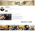
How Can Lord Vinheterio Sell More?
Awesome pianist on Youtube. But can Lord Vinheterio sell more?
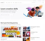
How Can Tutsplus Sell More?
An elearning website. How can Tutsplus sell more?

About. Updates. Disclaimer. Privacy. Mission/ Vision. FAQ. Newsletter.
Copyright © 2024- Jasonera.com All rights reserved

Latest Articles
-
Ebook Resell Rights: How To Profit And Beat Your Competition
 Ebook resell rights seems new, but it is an old marketing technique. Here's how to do it properly.
 -
How To Find The Best Ebook Content That Sells
 So, making an ebook is fine, what do you put into it that will sell? Can what we like be ebook content?
 -
How To Start Making Your Ebooks Profitable Today
 They can be cheap or expensive to make. Tons are produced. So are ebooks profitable?


